EyeCare Specialties Logo Critique 209

Nic submitted this logo for EyeCare Specialties. He left the following comment about his work.
“This logo design is part of a larger re-branding of the company including its website (soon to come). We are limited to using the current logo’s ‘shape’ (see website). Overall we would like the mark to have a liquid - or - soft feel. Thusly, we have been working with watercolor as the basis of the new mark.”
The following critique is based on one designer’s opinion and experience. I always appreciate the readers thoughts as well. So, I’ll ask a question of two in the critique, please share your perspective in the comments at the end of this logo design critique.
Design Principals
This logo is a vast improvement over the previous logo. The mark has a fresh and soft feel to it which fits the look Nic was trying to achieve. The color choice is revitalizing and spa-like. Overall the mark is off to great start. Still, there are some alignment issues that could benefit from some slight adjustment.
Continue reading this articleHarmony Eye Care 31

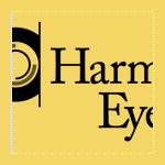
Randy submitted his logo for Harmony Eye Care. He included this message with his submission,
“Harmony EyeCare is a brand new Optometry office opening up in southern Indiana. I wanted convey harmony inside the eye itself. The graphic is meant to be a harmonious iris of an eye. I chose a serif typeface for it’s elegance... Caslon seemed to fit well.”
The following critique is based on one designer’s opinion and experience.
Design Principals
This logo is well put together. The subdued color palette and Caslon typeface give off a soothing impression, which fits well with the company name.
Continue reading this articleThe images & logos presented on this blog are copyrighted by their respective owners. The blog itself is copyright Erik Peterson, 2008-2026 All Rights Reserved.


