Jen Blume Logo Design Critique 31
Categories: Critiques Marketing & Design

Jen submitted this her company logo for critique and left the following comment about her goals for the logo design,
“This is a logo for my own design firm. I was going for a very graphic design using playful and creative typography.”
The following critique is based on one designer’s opinion and experience. I always appreciate the readers thoughts as well. So, I’ll ask a question of two in the critique, please share your perspective in the comments at the end of this logo design critique.
Design Principals
I like that Jen is trying to communicate something about herself and possibly her design style through this logo. As I have said in the past, a good logo should make a statement about the company it represents, which is what you’re trying to do here. However, there are some areas that can be improved. In general, I feel like the logo looks more messy than it does playful. In particular, the ‘u’ and ‘e’ appear like they are about to fall to the ground. It also feels very constrained in its bounding box. Is there a reason for the containing rectangle?
Continue reading this articleColor Psychology in Logo Design 293

Color offers an instantaneous method for conveying meaning and message in your logo designs. It’s probably the most powerful non-verbal form of communication we can use as designers. Our minds are programmed to respond to color. The subliminal messages we get from color shape our thoughts. As humans our very survival is hung on the identification of color. We stop our cars for red lights and go on green, we look at the color of certain plants and animals to determine whether or not they are safe for us to eat or touch, the bottom line is that color is a very important part of our daily lives. It’s important for us as designers to use color appropriately and understand the meaning behind the colors we choose.
Continue reading this articleRandom Photography Logo Design Critique 63

Denny at Random Photography sent in this logo for his photography business. He included the following information about his company and logo,
“In my photography business, I photograph nearly all kinds of assignments, from aerial, corporate, commercial, advertising...etc. So I wanted my logo to say “Random” when you look at it. It’s very simple, but I think says that. Yes, it does use a camera in it but hopefully that’s small enough so as to not overpower, but just give the suggestion. I don’t always use the logo with the url and line below it, usually just the logo and tag phrase.”
The following critique is based on one designer’s opinion and experience. I always appreciate the readers thoughts as well. So, I’ll ask a question of two in the critique, please share your perspective in the comments at the end of this logo design critique.
Design Principals
Unfortunately, the random letters and fonts that make up the word ‘random’ remind me more of ransom note than something random. I mean I get the ‘randomness’ but upon first view my mind goes to ransom note instead. To avoid that visual confusion maybe there’s another way to show the concept of ‘random’. One idea to explore might be something as simple as using the same typeface for all of the letters in the word ‘random’ but alter the size and placement to create a random feel.
Continue reading this articleJack Tree Thai Cuisine Logo Design Critique 49
Categories: Critiques Food & Beverages
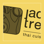
Mario submitted this logo for Jack Tree Thai Cuisine and had this to say about his logo,
“The colours and logo name were already handpicked by the client according to his personal auspicious religious beliefs. These colours denotes growth and energy. The jack tree is a plant which is very common in Sri Lanka. The logo is a stylized Jack Tree and you will be able to make out the tree and a jackfruit. client wanted simple yet strong typo for the logo. I stylized the typo by linking the letter 'j' and 't' I kept the typo separate from the icon, in order to have the freedom to use the icon all by itself.”
The following critique is based on one designer’s opinion and experience. I always appreciate the readers thoughts as well. So, I’ll ask a question of two in the critique, please share your perspective in the comments at the end of this logo design critique.
Design Principals
The first thing I notice when looking at the Jack Tree Thai Cuisine logo is the ‘j’ and ‘t’ ligature. I don’t care for this ligature. A ligature should create rhythm and flow within the type. This one tends to interrupt both and feels forced. Continue reading this article
Sophie’s Tavern Logo Design Critique 90
Categories: Critiques Food & Beverages
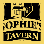
Kevin submitted this logo for Sophie’s Tavern along with the following commentary,
“Sophie’s Tavern is located in the heart of Camden, NJ and has been a cornerstone of the community since 1933. Like the city itself, Sophie’s has recently undergone a major renovation to improve the facilities both inside and out. It was decided that the building itself would be featured as it is such a recognized building in Camden. The main goal was to keep the home town feel of the bar to remind regulars and locals of the history and also introduce the bar as a great place to eat and drink to those who are unfamiliar with Sophie’s. A 3D model was built in SketchUp and then converted to vector art in Illustrator.”
The following critique is based on one designer’s opinion and experience. I always appreciate the readers thoughts as well. So, I’ll ask a question of two in the critique, please share your perspective in the comments at the end of this logo design critique.
Continue reading this articleMichael Austin Designs Logo Design Critique 43
Categories: Critiques Marketing & Design

Mike submitted this logo redesign for his design company. He had the following to say about his new logo,
“This is my revision to my previous logo. I wanted to add more of an an artistic flair to the design. My initials are used to create mountain bringing a strong presence to the logo. The mountains are drawn with a paint brush effect. The font I used is BigNoodleTitling,this font is “firm”, but not overbearing to the overall logo.”
The following critique is based on one designer’s opinion and experience. I always appreciate the readers thoughts as well. So, I’ll ask a question or two in the critique, please share your perspective in the comments at the end of this logo design critique.
Design Principals
The redesigned logo for Mike’s company is certainly an improvement over the old. The old logo felt disjointed and amateur, while the redesign feels more current and balanced.
Continue reading this articleAaron Lindberg Photography Logo Critique 39

Aaron submitted this logo for his work as a photographer. He included the following commentary with his submission,
“I decided to revamp my logo and wanted to get some feedback from the new look. I plan on using the logo with and without the url at the bottom of the page.”
The following critique is based on one designer’s opinion and experience. I always appreciate the readers thoughts as well. So, I’ll ask a question of two in the critique, please share your perspective in the comments at the end of this logo design critique.
Design Principals
I don’t know what the old logo looked like, but I think the new one has depth and perspective. It appears lively and dynamic. Are these traits the same traits you would use to describe yourself or your work as a photographer?
Continue reading this articleWhat Makes a Great Logo Design? 250

A logo, trademark, emblem, brand, logotype, symbol, identity, mark, insignia represents a company to consumers. It gets its meaning from the company it represents, not the other way around. It’s effectiveness can help to sell a product or service to the public. It’s the identifier that consumers sometimes attach themselves to and become loyal to. It’s a visual expression of a company, product or service. The role of the logo is to point or designate in the simplest form possible.
There are five elements that you can find in great and successful logo designs. Most of the logos you know and love will meet all these criteria. When you think of a great logo what brands come to mind? Remember the logos for those brands as you read through this article and see if they meet the five criteria.
Continue reading this articleNeonKids Logo Concepts Critique 69
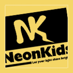
I received 4 logo concepts, at various stages of completeness, from Phil. He is working on a logo for a children’s ministry called “NeonKids”. The children in this group are from 3-14 years old. Phil had this to say about his project,
“The ministry is going to be called “NeonKids”, with the tag-line “Let your light shine brightly”. Some of the concepts I’ve played around with electricity, lightning bolts, light bulbs since those are some of the elements that are in the general theme the program is looking for.”
Once again, I won’t be following the normal format for critique that I’ve been using up until now. Instead, I’m going to pick two concepts from the group that I think have the most potential. I will critique them and offer thoughts on some other conceptual directions for Phil to explore.
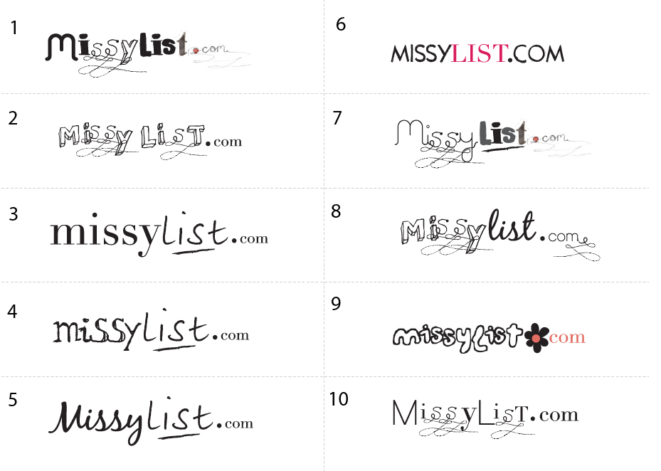
Continue reading this articleMissylist Logo Concepts Critique 47
Categories: Critiques Computers & Technology Services

The folks over at MissyList submitted a whole bunch of logo concepts, 10 to be exact. If you’re interested in seeing them all, here ya go.
I won’t be following the normal format for critique that I’ve been using up until now. Instead, I’m going to pick three concepts from the group that I think have the most potential. I will critique and talk about what’s working and what’s not.
According to the company info I received, the target market for the site is described as: female, 25-40 years old, young professionals, students, mothers, computer savvy, social network savvy, online shoppers. The tone & feel of the site was described as: girly fun, slightly sophisticated, community safe, trendy, second hand, bargain, recession fighter. The company used to be called feminads but is now being rebranded.
Continue reading this articleThe images & logos presented on this blog are copyrighted by their respective owners. The blog itself is copyright Erik Peterson, 2008-2026 All Rights Reserved.


