William Dyrcz Attorney at Law 34
Categories: Critiques Business & Law Services

Andy submitted this logo he is working on for “William Dyrcz Attorney at Law”. As I understand it, this law firm specializes in real estate planning and tax laws.
This logo falls under the monogram category, meaning it’s only the initials of the company. In most cases, the monogram would show all the initials of the company (WDAL). In this case we are just looking at the ‘W’ & ‘D’. There is also no other text displayed with this monogram, which hurts this implementation greatly.
Design Principals
I’m going to assume this is only a rough version of what Andy intends the logo to be. It is obvious the mark was drawn by hand and colored with marker. This would never suffice as final art. I also want to mention, the version that was submitted isn't an exact circle (close but not quite). Either make the mark within an exact circle or make it obvious that it wasn’t supposed to be a circle. As it stands now, it looks like a mistake.
Continue reading this articleLike No Other Productions 98
Categories: Critiques Entertainment

Andrew from Like No Other Productions submitted this logo for critique. Along with his submission, he mentioned that his company
“...will be making showreels, trailers, commercials, and other misc editing jobs, as well as making my own short films and creative endeavors.”
Andrew went on to say,
“I was drawn to pixel art because it has the interesting property of being able to be scaled to virtually any size without losing its shape; this fits with the sort of work we will be doing; anything for anyone in any medium.”
It's always nice to get some perspective on the designers thoughts before beginning a critique. So without further ado, the following critique is based on one designer's opinions and experience.
Design Principals
The first thing that strikes me when I see this logo is that is hard to read. It really does take a second to make out the word ‘Productions’.
Continue reading this articleBay View Builders 46
Categories: Critiques Home & Construction
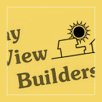
Bay View Builders allowed us to critique their logo. The following critique is based on one designer's opinions and experience.
Let me start by saying, I'm sure the original designer had good intentions. The logo, while needing some work, does at least communicate that Bay View Builders does most likely build residential homes.
Design Principals
Let's start by talking about the overall design of the logo. Visually, the logo appears ready to tip over to the left. The stair stepped typography and the open white space in the lower left contribute to this problem. One way to help solve this might be to put the type all on one line beneath the illustration.
Continue reading this articleThe images & logos presented on this blog are copyrighted by their respective owners. The blog itself is copyright Erik Peterson, 2008-2026 All Rights Reserved.